Brand Update
A new mark for KRYIL
We have refreshed our logo and colour system. The name has not changed, the company has not changed, and no contract, invoice or agreement is affected. What has changed is the mark that carries them.
Previous logo — last date of use
8 July 2026
New logo — effective from
9 July 2026

Retired
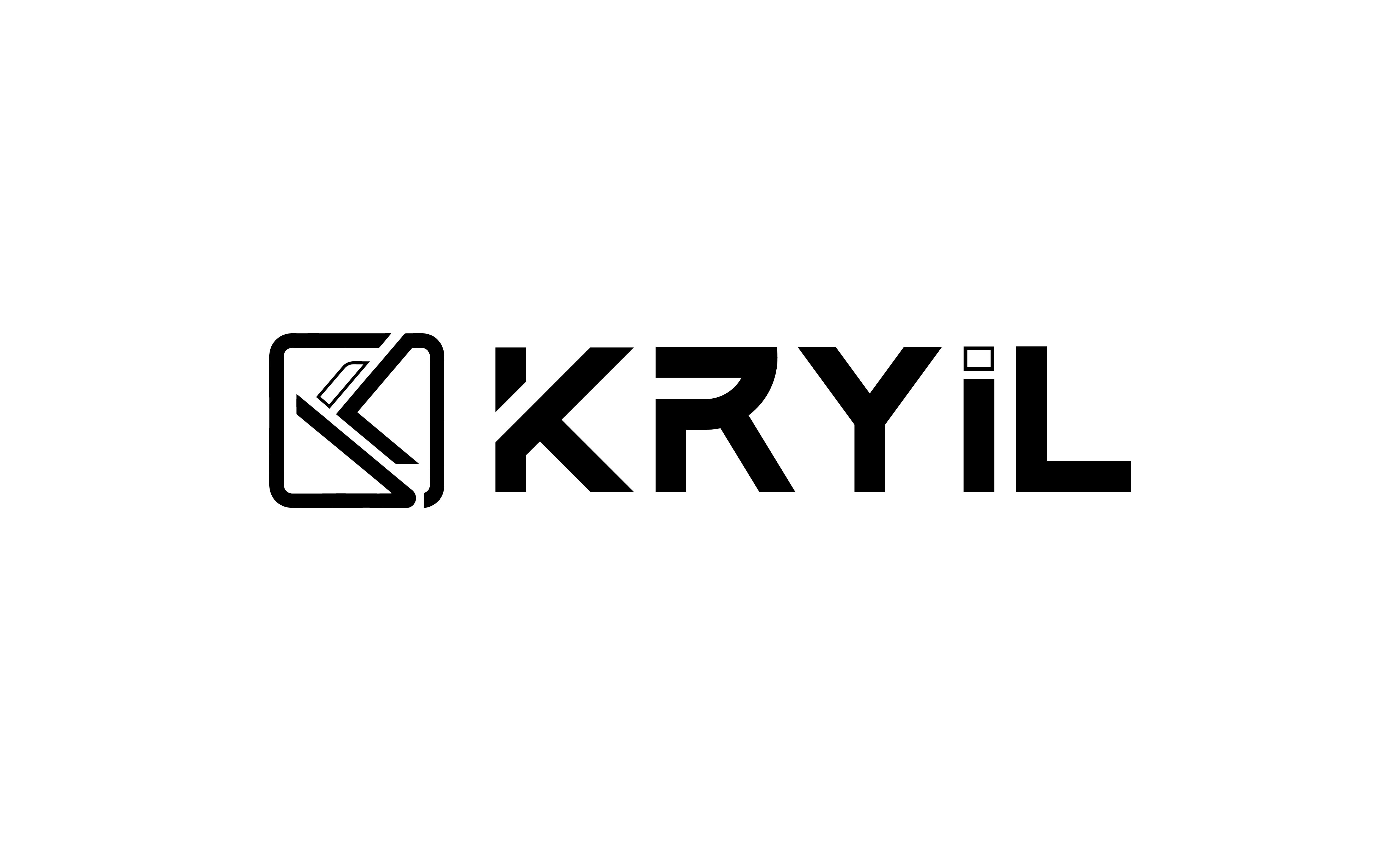
Previous logo
In use through 8 July 2026. Please remove it from any remaining signature, deck, signage or template.
Current
New logo
Effective 9 July 2026. This is the only approved KRYIL Infotech mark going forward.
What changed
The mark
The enclosing circle becomes a rounded square — a frame with structure rather than an orbit. The K is redrawn as a single continuous path, opening the form up instead of containing it.
The palette
Monochrome gives way to a two-colour system: Kryil Blue for signal, Kryil Gray for structure. The mark now reads at small sizes without relying on background contrast alone.
The wordmark
KRYIL is set in a wider, flatter cut with more even spacing. The "i" carries a detached square dot in blue — a small fixed point that ties the wordmark back to the mark.
The system
One lockup, one icon, defined colour and reversed variants. Every application draws from the same set of files rather than redrawing the logo per medium.
Brand colours
Kryil Blue
#25A9E0Primary accent — the mark, the dot on the "i", interactive states.
Kryil Gray
#747472Wordmark and secondary structure. Neutral, engineered, quiet.
Download the assets
Prefer the SVG files wherever the medium allows — they stay sharp at every size. Do not recolour, stretch, rotate, add effects to, or rebuild the mark; use these files as supplied.

Questions about the change?
If you are a partner, supplier or customer holding KRYIL materials that still carry the previous mark, get in touch and we will send the replacements you need.
Contact us